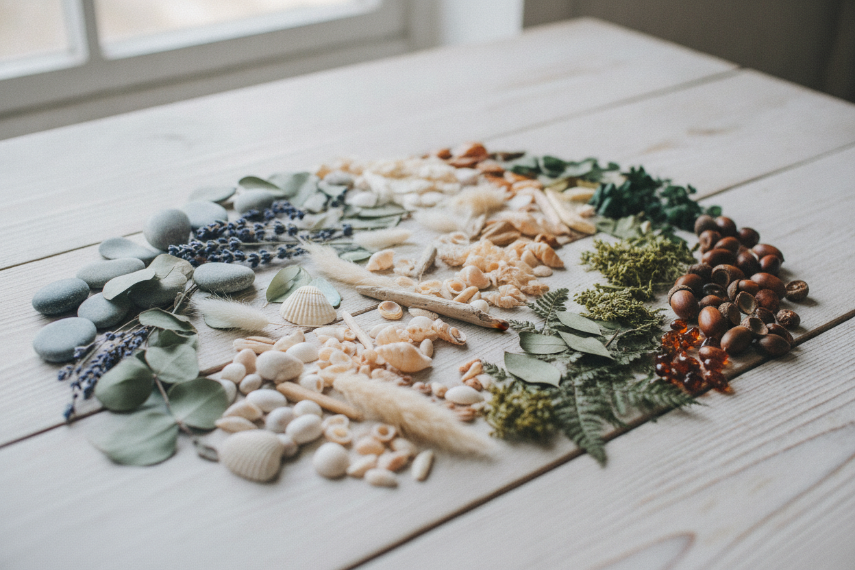
Nature-inspired color palettes are a beautiful way to make a blog feel warm and memorable. Greens are especially versatile because they can suggest growth, calm, freshness, and balance all at once. When used thoughtfully, they create a visual language that feels inviting without overwhelming the reader.
One helpful approach is to mix different shades with clear purpose. A deep forest green can anchor the design, while a softer sage or mint tone can lighten the overall feel. Accent colors drawn from nature, such as cream, brown, or muted gold, can add contrast without breaking the mood. This kind of palette works especially well for minimalist sites because it adds character while preserving simplicity.
Color also affects readability. A beautiful palette still needs enough contrast for text, buttons, and navigation to remain easy to use. That means choosing background and accent colors carefully rather than relying on aesthetics alone. The best results come when style and accessibility work together.
For a personal blog, the palette should support the voice of the content. If your writing feels calm, reflective, and personal, nature-inspired colors can reinforce that feeling before readers even begin scrolling. They make the site feel cohesive and thoughtful, which helps build a stronger connection with your audience. A well-chosen palette is not just decoration; it is part of the experience.
Leave a Reply